Color Theory Essentials for Digital Artists
Coartist Team
Color Theory Essentials for Digital Artists
The first time you really see color, it changes everything.
I remember the moment it clicked for me. I was struggling with a digital painting—everything was technically fine, but it looked... flat. Dead. Like a coloring book someone had filled in competently but without joy.
Then I noticed something: every color in my painting was roughly the same saturation. Every shadow was just a darker version of the local color. Every highlight was just white added on top. I had been "coloring" my painting instead of lighting it.
That realization sent me down a rabbit hole of color theory that transformed my work. And the beautiful thing about color theory? It's not mysterious. It's not talent. It's knowledge—and knowledge can be learned.
Let's break down the color concepts that will change how you see and use color forever.
Why Color Is Your Most Powerful Tool
Before we dive into the technical stuff, I want you to understand why color matters so much.
Color is processed by your brain before conscious thought kicks in. When you see a warm orange glow, you feel warmth before you think "that's orange." When you see deep blue shadows, you feel coolness or depth instantaneously.
This means color communicates on a primal level. The right color choices can make viewers feel:
- Calm or anxious
- Happy or melancholic
- Energized or peaceful
- Nostalgic or futuristic
And here's the kicker: your viewers won't know why they feel these things. They'll just think your artwork is "good." Color is the secret weapon that separates amateur work from professional work—and most people never realize it's happening.
The Color Wheel: Your Map to Color Relationships
The color wheel isn't just a tool for beginners—it's a map that professional artists refer to constantly. Understanding this map unlocks everything else.
Primary Colors: Where It All Starts
In traditional painting, we work with red, yellow, and blue as primaries—the colors that can't be mixed from other colors.
In digital work (and light itself), we work with red, green, and blue (RGB). This matters because your screen is literally shooting these colors at your eyes.
But here's what matters for practical purposes: primaries are your foundation. They're the "parents" that create all other colors.
Secondary Colors: The First Generation
Mix two primaries, get a secondary:
- Red + Yellow = Orange — warmth, energy, autumn
- Yellow + Blue = Green — nature, growth, freshness
- Blue + Red = Purple — luxury, mystery, creativity
These associations aren't arbitrary—they're deeply embedded in human psychology through millennia of experience with the natural world.
Tertiary Colors: The Full Spectrum
Mix a primary with its neighboring secondary, and you get tertiaries: red-orange, yellow-orange, yellow-green, blue-green, blue-purple, red-purple.
These "in-between" colors are often the most sophisticated. They're subtle. They're nuanced. And they're often underused by artists who stick to pure primaries and secondaries.
Pro tip: Some of the most beautiful palettes use almost exclusively tertiary colors, with primaries reserved only for the highest-impact moments.
Color Harmony: Why Some Palettes Sing
You've seen it before: a color combination that just works. It might be bold or subtle, but something about it feels complete. That's color harmony.
Color harmony isn't magic—it's predictable relationships on the color wheel.
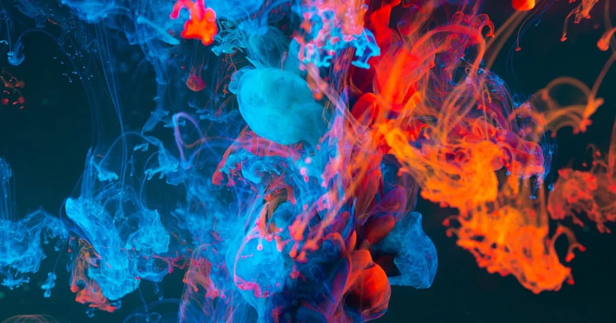
Complementary Colors: Maximum Drama
Colors opposite each other on the wheel create maximum contrast. Orange and blue. Red and green. Yellow and purple.
These combinations vibrate. They demand attention. Used at full saturation, they can be almost too intense to look at. But used thoughtfully—one color dominant, the other as an accent—they create dynamic, energetic compositions.
When to use: Action scenes, high-energy subjects, anything that needs to POP.
The beginner trap: Using complements at equal saturation and equal amounts. This creates visual chaos. Instead, let one complement dominate (maybe 70% of your color area) and use the other sparingly as an accent.
Analogous Colors: Harmony and Mood
Colors next to each other on the wheel create analogous schemes. Yellow, yellow-orange, and orange. Blue, blue-green, and green.
These palettes feel harmonious and unified because the colors share underlying hues. They're perfect for creating mood and atmosphere.
When to use: Portraits, atmospheric scenes, anything that needs to feel cohesive and immersive.
The secret: Add a tiny touch of a complement as an accent. In a warm analogous palette (oranges and reds), a small spot of blue makes everything else feel warmer by contrast.
Triadic Colors: Balanced Vibrancy
Three colors equally spaced on the wheel—like red, yellow, and blue—create triadic harmony.
These schemes are balanced but vibrant. They can handle more saturation than complementary schemes without feeling chaotic.
When to use: Comic art, illustration, anything that needs to feel colorful but balanced.
Split Complementary: Sophistication
Instead of using a color's direct complement, use the two colors adjacent to its complement. It's like complementary harmony with the edges softened.
When to use: When you want contrast but complementary feels too harsh.
Value: The Foundation Under Your Colors
Here's a truth that took me years to truly understand: value is more important than hue.
Value is how light or dark a color is. A composition with strong value structure will read clearly even in grayscale. A composition with weak value structure will feel flat and confusing no matter how beautiful the colors.
The grayscale test:
Take any piece you're working on and desaturate it (convert to black and white). Does it still read? Can you see depth, form, and hierarchy? If not, no amount of color wizardry will save it.
Building with value:
Before you think about color, establish your values:
- Identify your light source. Where is light coming from?
- Block in major value shapes. What's in light? What's in shadow?
- Establish your value range. How dark are your darkest darks? How light are your lightest lights?
Once your values are solid, you can layer color on top with confidence.
Temperature: The Invisible Dimension
Every color has a temperature. Reds and oranges feel warm. Blues and greens feel cool. But here's where it gets interesting: any hue can be warm or cool relative to other colors.
A blue can be warm (leaning toward purple) or cool (leaning toward green). A red can be warm (leaning toward orange) or cool (leaning toward purple).
Why temperature matters:
- Light is usually warm, shadow is usually cool (under natural daylight)
- Warm colors advance, cool colors recede (creating depth)
- Temperature contrast creates visual interest (even more than hue contrast)
The temperature shift secret:
One of the most powerful techniques in color is shifting temperature as you move through form. As a sphere turns away from warm light into shadow, it doesn't just get darker—it shifts cooler. This temperature shift is what makes surfaces feel three-dimensional and luminous.
Saturation: The Volume Knob
Saturation is how pure or muted a color is. Full saturation is intense, vibrant, demanding attention. Low saturation is subtle, atmospheric, sophisticated.
The saturation trap:
Beginners often crank saturation because intense colors feel "better." But like a song where every instrument is at maximum volume, oversaturated artwork is exhausting to look at.
Using saturation strategically:
- Reserve high saturation for focal points. Let your most important elements be the most vibrant.
- Use muted colors for atmosphere. Backgrounds, less important elements, and areas you want to recede should be less saturated.
- Let complementary colors neutralize each other in shadows. When warm light meets cool shadow, the transition zone is often quite desaturated.
The mood of saturation:
- High saturation = energy, intensity, fantasy, comic-book reality
- Low saturation = atmosphere, sophistication, realism, melancholy
Neither is "better"—they're different tools for different purposes.
Digital-Specific Color Challenges
Digital art presents unique color challenges that traditional painters don't face:
Monitor Calibration
Your monitor might be lying to you. Colors can display differently on different screens, and an uncalibrated monitor might be showing you colors that look nothing like what others will see.
What to do:
- Invest in monitor calibration if you're serious about color accuracy
- At minimum, check your work on multiple devices before finalizing
- Be aware that print colors will never match screen colors exactly
Color Spaces: sRGB, Adobe RGB, and Beyond
Different color spaces can represent different ranges of colors. sRGB is the web standard and what most people will see. Adobe RGB has a wider gamut, useful for print work.
The practical takeaway: Work in sRGB for web-intended work unless you specifically need wider gamut for print.
The Seduction of Easy Adjustment
Digital tools make it almost too easy to adjust colors. Sliders let you shift entire palettes in seconds. This is powerful but dangerous.
The risk: You can slider your way into color combinations that feel "exciting" in isolation but don't serve the piece. Or you can adjust endlessly without ever committing to a cohesive vision.
The solution: Make deliberate color choices early and stick to them unless you have a specific reason to change. The undo button is useful, but it can also be a crutch.
Practical Color Exercises
Theory only gets you so far. Here are exercises that will train your eye:
Color Matching
Find a photograph you love and try to recreate its palette by sampling colors. Notice how different the actual colors are from what you thought you saw.
Master Studies
Pick a painting by an artist known for color—Sorolla, Mucha, Vermeer—and analyze their palette. What colors are they actually using? How do the temperatures shift? Where is saturation used?
Limited Palettes
Force yourself to complete a piece using only:
- One warm color, one cool color, and white
- Three colors plus white
- A specific, predetermined palette
Constraints reveal principles you'd never discover with unlimited options.
Daily Color Thumbnails
Spend 10 minutes a day doing quick color thumbnails. Don't worry about drawing skill—just explore color relationships. It's like scales for musicians.
How AI Helps You Master Color
One of the hardest things about color is seeing your own blind spots. You might consistently make the same color mistakes without realizing it.
Coartist's AI provides detailed color analysis including:
Palette assessment:
- How harmonious is your palette according to established color theory?
- Are you using complementary, analogous, or other relationships effectively?
Value structure:
- Does your piece have strong value contrast?
- Are your darks dark enough? Are your lights light enough?
Temperature analysis:
- How are warm and cool colors distributed?
- Is there effective temperature shift creating depth and interest?
Saturation evaluation:
- Is saturation used strategically to create hierarchy?
- Are there areas that would benefit from more or less saturation?
This kind of objective analysis helps you identify patterns in your work—both strengths to lean into and weaknesses to address.
The Lifelong Journey
Here's the thing about color: you never "finish" learning it. Painters with fifty years of experience still discover new things about how colors interact.
But the fundamentals I've laid out here—the color wheel, harmony types, value, temperature, saturation—will serve you for your entire career. Master these concepts, and you'll have a vocabulary for understanding what you see, why you feel what you feel about a palette, and how to achieve the color effects you're after.
Color isn't just decoration on top of your artwork. It's the emotional heart of it. Learn to speak its language, and your work will communicate in ways that words never could.
Want to see how your color choices measure up? Upload your artwork to Coartist and get detailed AI analysis of your palette, value structure, and temperature balance—along with specific suggestions for making your colors sing.
Related Articles

Anatomy for Artists: The Essential Guide
Understanding anatomy is crucial for creating believable figures. Learn the essential anatomy knowledge every artist needs.
Read article
Lighting Fundamentals: The Skill That Makes or Breaks Your Art
Light is everything in visual art. Here's how to understand it, use it, and make your artwork glow—literally and figuratively.
Read article
Color Harmony Troubleshooting: Why Your Palette Feels Off
If your colors look right individually but wrong together, you need harmony, not more swatches. Use these quick diagnostics and fixes.
Read article