Color Harmony Troubleshooting: Why Your Palette Feels Off
Coartist Team

Color Harmony Troubleshooting: Why Your Palette Feels Off
You can have great drawing and solid values and still end up with a painting that feels weirdly uncomfortable.
That feeling is usually not because your colors are "wrong." It is because they are not speaking the same language.
Color harmony is less about perfect theory and more about controlling three levers:
- Temperature (warm vs cool)
- Saturation (intensity)
- Range (how many different hues you allow)
This guide shows you how to diagnose the problem fast and fix it without repainting everything.
First: Check Values Before You Blame Color
Many "color problems" are value problems in disguise.
Do this first:
- Desaturate the painting.
- If it reads poorly in grayscale, fix values. Then return to color.
If the grayscale read is solid and it still feels off, you are dealing with harmony.
The 5 Most Common Harmony Breakers
1) Temperature is inconsistent
Example: the light is warm in one area and cool in another for no reason. The painting feels patchy.
Fix: decide your light temperature and your shadow temperature.
- Warm light usually creates cooler shadows.
- Cool light usually creates warmer shadows.
You can break this rule, but you need a reason.
2) Saturation is everywhere
When everything is saturated, nothing feels intentional. The eye gets tired.
Fix: reserve high saturation for accents.
Try this: pick one "hero" saturated color and mute everything else by 10 to 30 percent.
3) Too many unrelated hues
You are using every color you know. The palette has no family resemblance.
Fix: limit the palette.
A simple rule that works: choose 2 dominant hues, 1 supporting hue, and 1 accent.
4) Neutrals are missing
A painting with no neutrals can feel like a sticker sheet. Neutrals make saturated colors look rich.
Fix: add a neutral bridge.
Mix a gray or muted color that appears in multiple places: background, midtones, and shadows. It ties the piece together.
5) The focal point is not color-staged
The focal point needs a color advantage. If the same hue and saturation show up everywhere, the viewer does not know where to land.
Fix: stage color like light:
- Highest saturation near the focal point
- Lower saturation away from it
- Temperature contrast used intentionally near the focal area
Fast Diagnostics You Can Run in Minutes
Diagnostic 1: The "one color wash" test
Add a layer over the whole painting with a low opacity color wash (like a warm gray or cool gray). If the painting suddenly feels more unified, your palette needs a common undertone.
Diagnostic 2: The saturation map
Temporarily crank saturation up, then down. If the piece only looks good at extremes, your mid saturation control is unstable.
Diagnostic 3: The limited palette remake
Pick 5 colors and repaint a tiny thumbnail version. If the thumbnail looks better, your full painting has too many hues.
Limited Palettes That Almost Always Work
You do not need to copy these exactly. Use them as training wheels.
Palette A: Warm light, cool shadow (classic)
- Warm light: yellow-orange
- Cool shadow: blue-violet
- Neutral: warm gray
- Accent: red
Palette B: Cool light, warm shadow (moody)
- Cool light: blue-cyan
- Warm shadow: red-brown
- Neutral: cool gray
- Accent: yellow
Palette C: Analogous with one accent
- Dominant: blue
- Support: blue-green
- Support: violet
- Accent: orange
The 3 Step Fix: Unite, Then Accentuate
If your palette feels off, do not chase each problem color. Fix the system.
- Unite: add a common undertone or wash that appears everywhere.
- Simplify: reduce the number of hues, especially in shadows.
- Accentuate: place saturation and temperature contrast where you want focus.
How AI Feedback Helps With Harmony
Color harmony is hard to judge when you have stared at a piece for hours.
AI feedback can help by:
- Identifying temperature inconsistencies
- Flagging saturation competition around the focal point
- Suggesting limited palette directions based on your existing colors
Ask for the smallest changes that create the biggest unity, then test them in a thumbnail first.
Want a quick harmony diagnosis on your current painting? Upload your artwork to Coartist and ask for temperature and saturation staging feedback.

Coartist Team
The Coartist Team is dedicated to helping artists improve their craft through AI-powered feedback.
Related Articles

Value First: Fix Paintings With Better Light and Dark Structure
If your painting feels muddy or flat, it is usually a value problem. Use these fast tests and fixes to rebuild clarity with light and dark.
Read article
The Iteration Loop: A Step-by-Step Workflow From Draft to Final
Most artists do not need more effort. They need a better loop. Use this staged workflow to iterate faster and finish stronger pieces.
Read article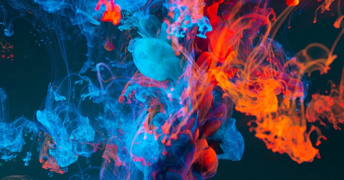
Color Theory Essentials for Digital Artists
Understanding color theory is essential for creating visually stunning artwork. This guide covers the fundamentals every digital artist needs to know.
Read article